CLIENT / PROJECT
Alternative Medicine Brewing Company
Branding and Identity
OVERVIEW
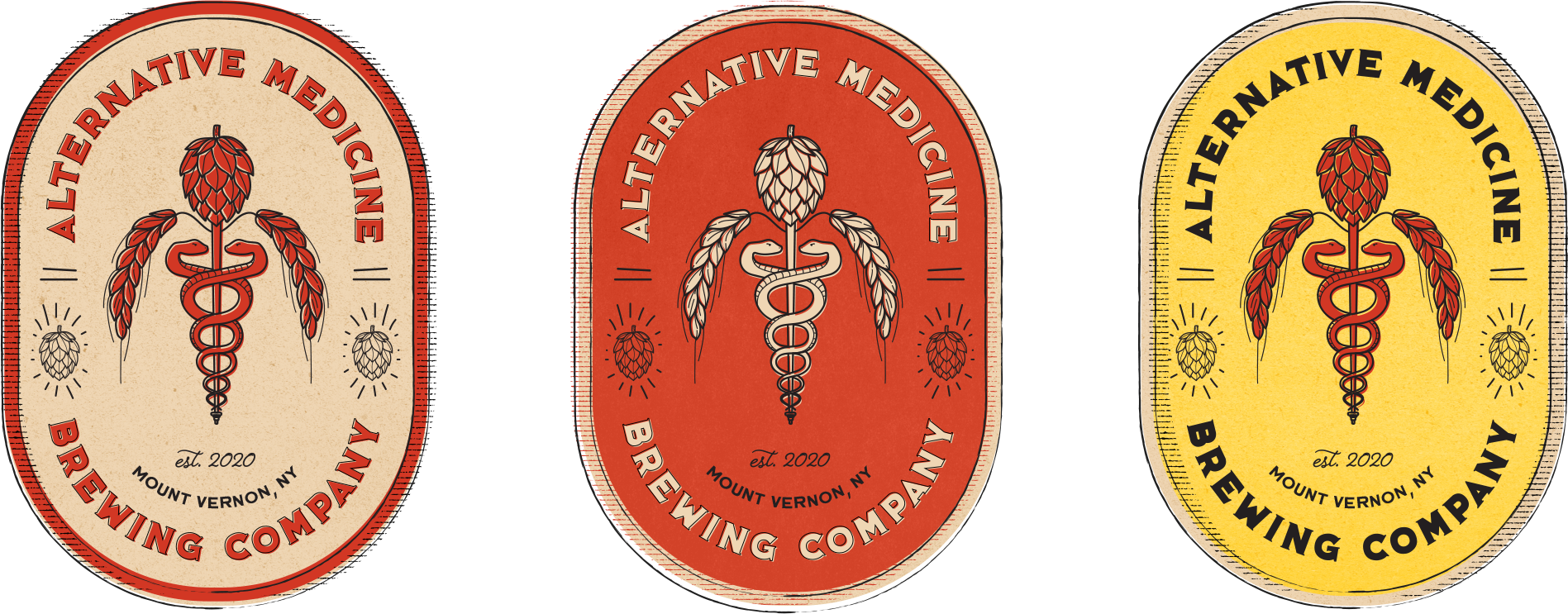
Alternative Medicine Brewing Company opened in Mount Vernon, NY, in 2021. But as of 2020, they still didn’t have a brand identity – luckily, they had us. Playing off their clever name (a tongue-in-cheek nod to cure-alls and pseudoscience through the ages), we created branding to back it up.
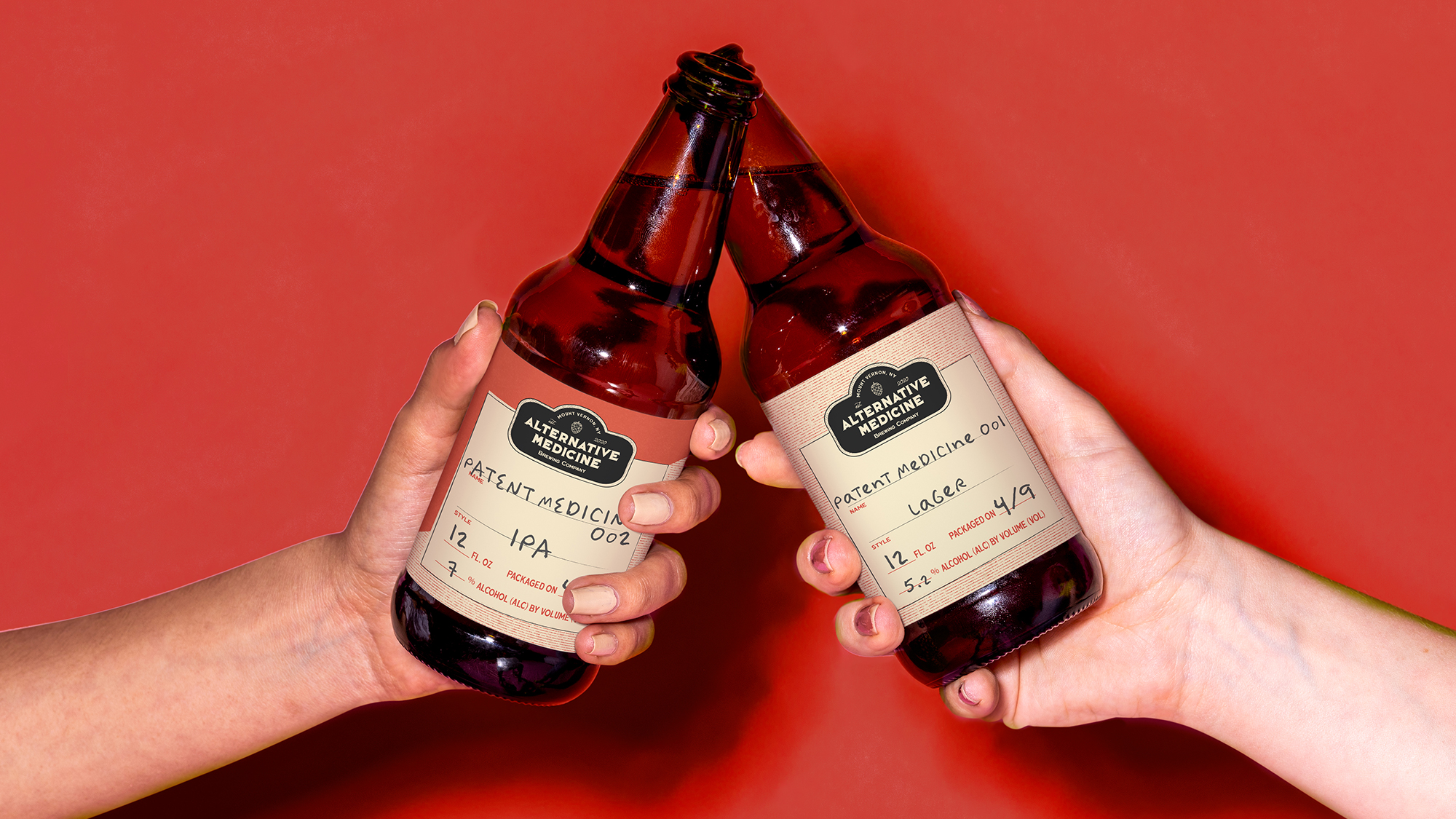
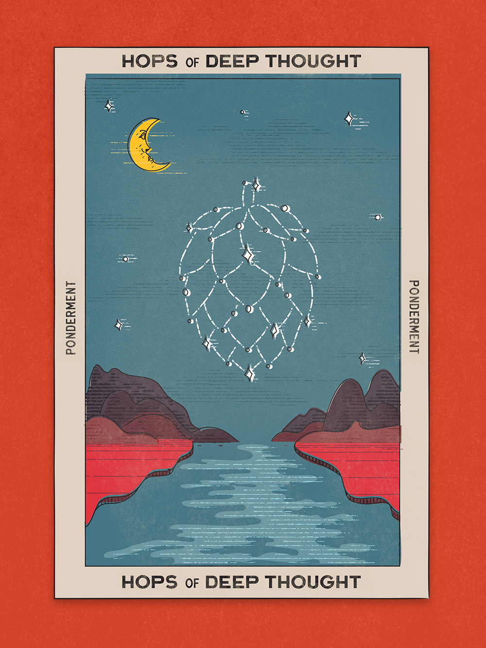
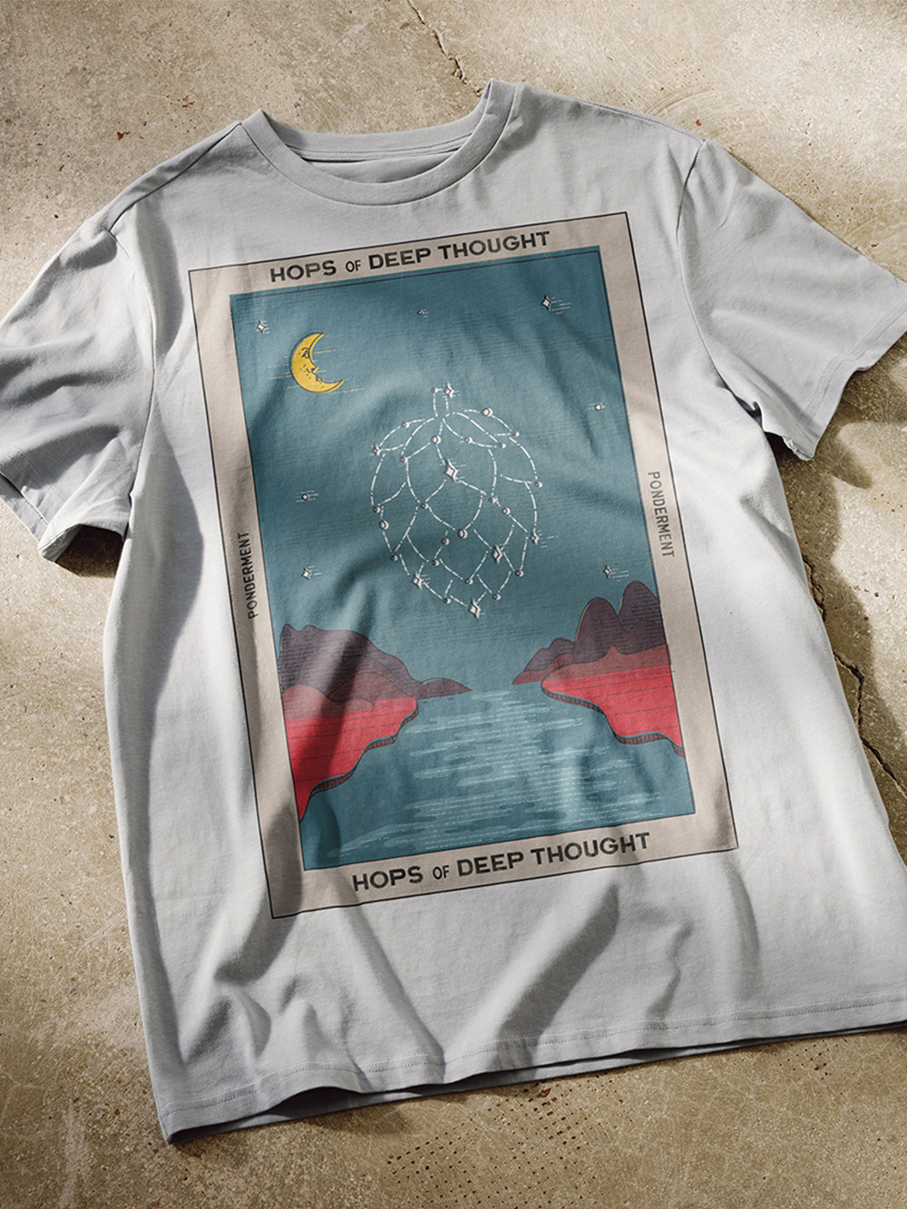
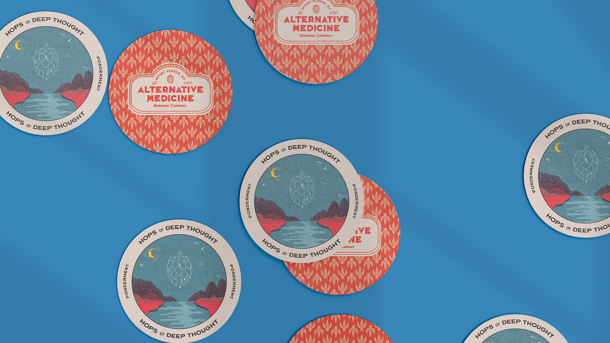
To develop a visual style that aligned with their playful name, we delved into the rich design history of patent medicine branding and advertising from the Victorian era, tarot cards from the 18th and 19th century and surreal art. The result is quirky and intriguing, using warm, vintage textures and colors with a contemporary aesthetic – a truly distinct look.
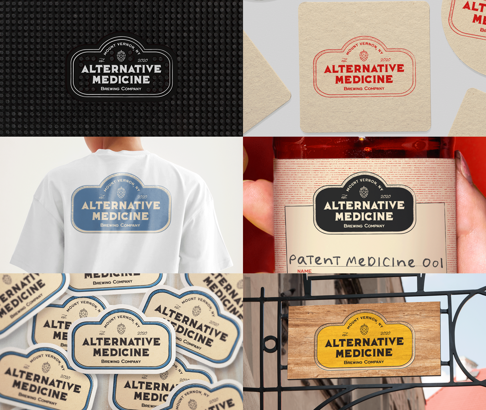
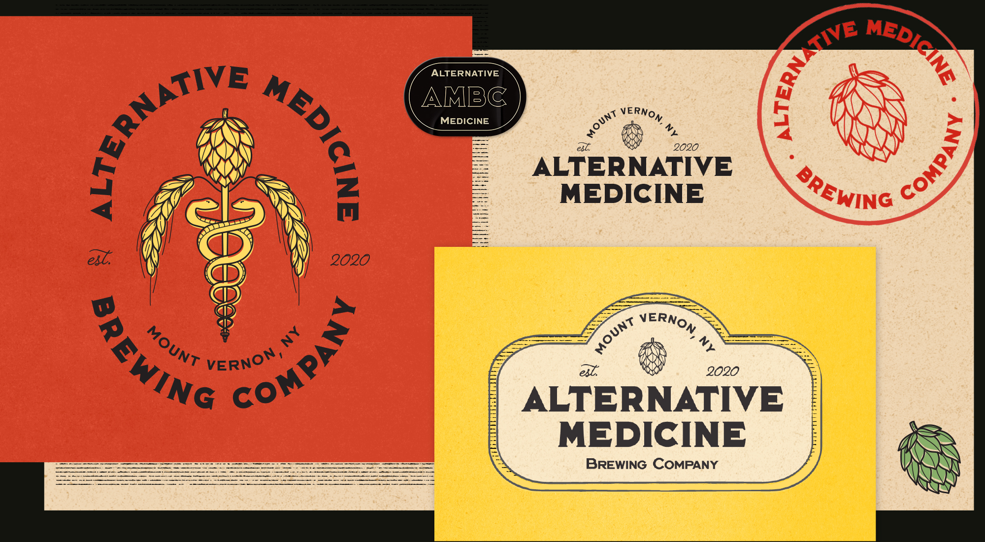
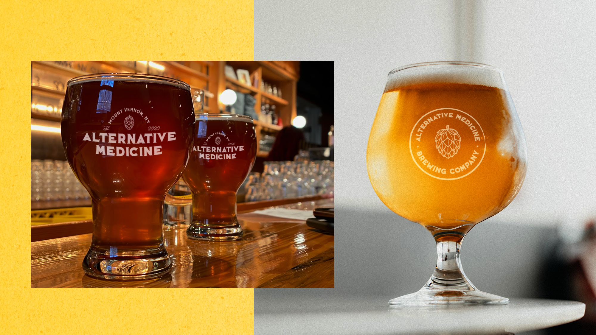
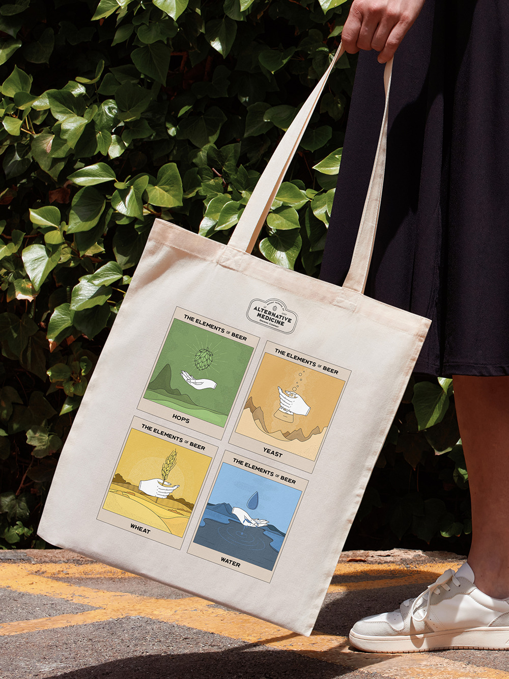
But their visual identity needed to go beyond the bottle, too. Knowing that Alternative Medicine Brewing Company would use their logo in many ways across the brand (not just bottles, but also social media, tap-pulls, signage, merchandise and more.), we created a flexible brand system that accommodated any execution that came their way. With this in mind, our series of logos and brand marks ranged from the most simple form of their name, “AMBC”, to a detailed illustration including their full name, location and distinctive ornamentation. The system is cohesive, with each mark unified by the AMBC look and feel, while also offering multiple directions to choose from at every branding opportunity.
ROLES
Brand Design
Logo Development
Packaging Design
Illustration

Can Design
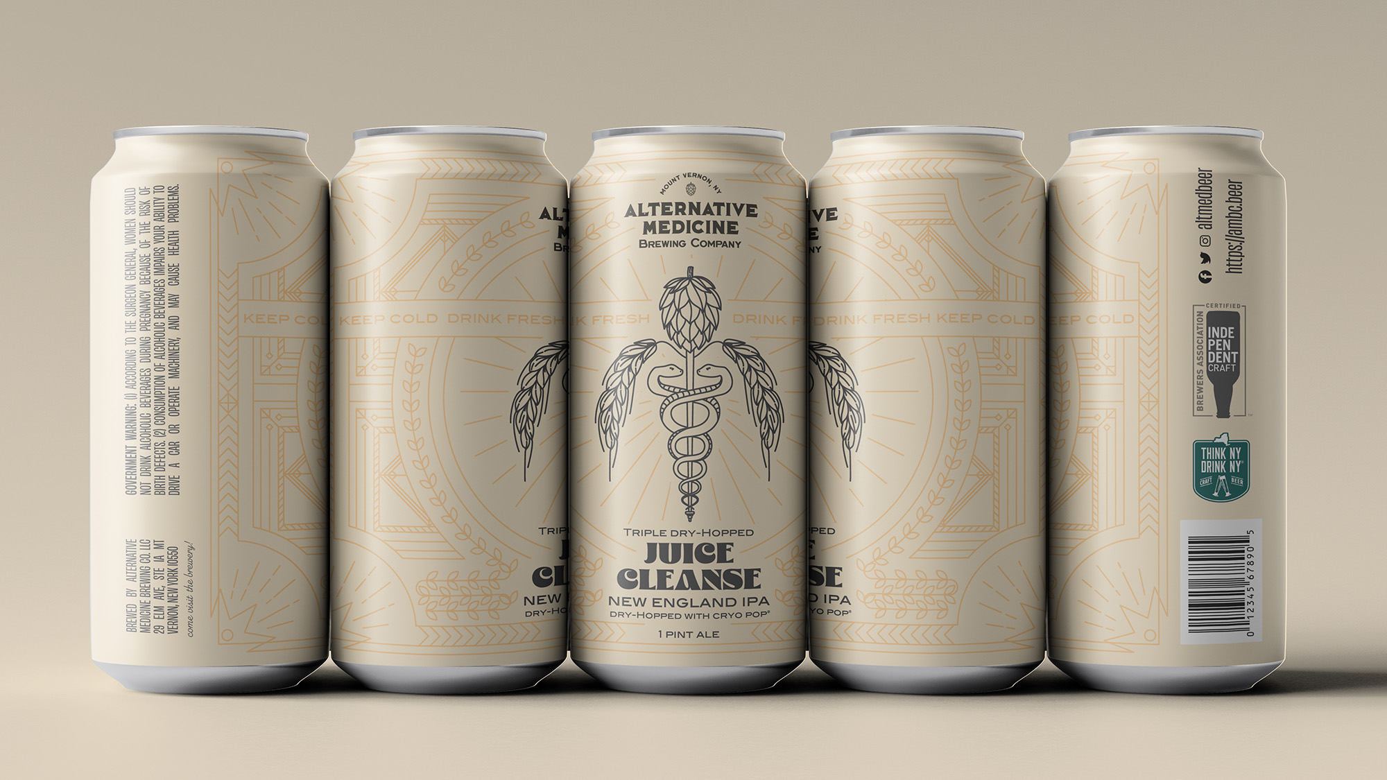
AMBC wanted a label for their flagship brew: the triple dry-hopped Juice Cleanse. But they didn’t want a one-off design – they wanted this label to set the look and feel for all future labels as well, making production a matter of switching out fonts and colors. Highlighting the signature Alternative Medicine caduceus graphic, we created a detailed surrounding illustration reminiscent of ornate Victorian apothecary bottles, in a subtle shade of the background color to draw attention to the caduceus and logo.
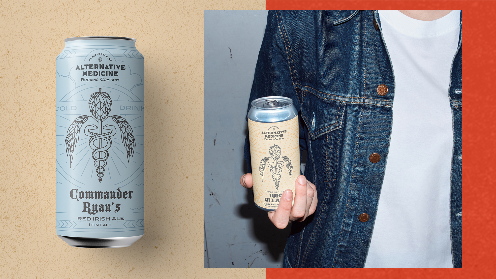
The label design can be repurposed for various different future brews, from using the same illustration and font in different colors for different iterations of Juice Cleanse, to introducing a new color, font and illustration for entirely different beers (like the Commander Ryan’s Irish Red Ale pictured here).
