Most years at SB&A we have written about the trends we expect to see emerging in the year ahead. This year, instead, I’d like to write about what I saw emerge in 2023. While seeing into the future is very impressive, I don’t think we can tell what’s ahead until we understand what’s behind us. On the Creative Team at SB&A, we are always keeping an eye out for visual patterns and trends while we work–these are a few of the trends that I saw come to the surface over the last year.
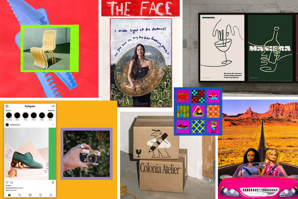
Mixed Media
We’ve noticed many designers, photographers and brands are using image-making techniques inspired by the human touch. In particular, we’re seeing collage-style images and illustrations incorporated into photos. What’s nice about this trend is that there are so many ways to play around with it, meaning that there’s lots of room for imagination, creativity, and opportunity to create a distinctive look.

Images (clockwise from top left): Sabah Foster // The Face Magazine // 247 Studio // Elizabeth Renstrom // Sabah Foster // Pau Bassol // Libbie Bischoff
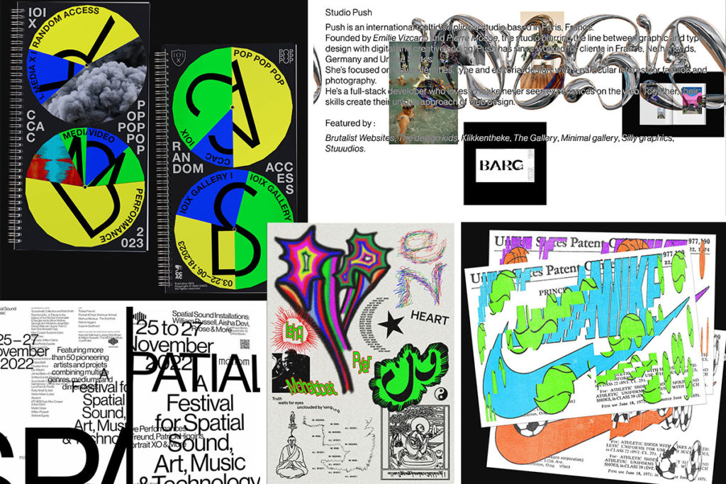
Anti-Design
There’s been a rise in the popularity of anti-design which, to me, feels like a rebellion against the minimalist design that has engulfed much of UX design in the last decade. Anti-design doesn’t necessarily mean “void of design”, rather it refers to breaking the more conventional rules of design; traditional layouts, grids, and typography are left by the wayside in favor of more unique, artistic, and unexpected approaches. The results aren’t always to everyone’s tastes, but you have to agree, they’re memorable–and that’s the point.

Images (clockwise from top left): Day Stay Hay // Studio Push // Day Stay Hay // House of Gül // Pràctica
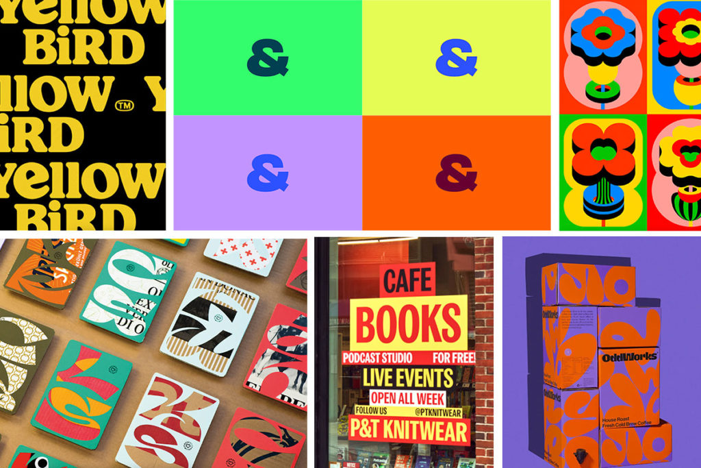
Bold
There’s a lot of color going around and we love it. This trend has been staking its claim in the design world with colors and typography that capture your attention and make you smile. Subtlety doesn’t have a place here. For typography think chunky sans serifs and groovy, organic shapes. And as for color, anything goes! Does it clash? Great. Pattern on pattern? Great. More is more, apparently.

Images (clockwise from top left): Bodega Design Studio // SB&A // Laura Normand // andstudio agency // Pràctica // EIGA Design
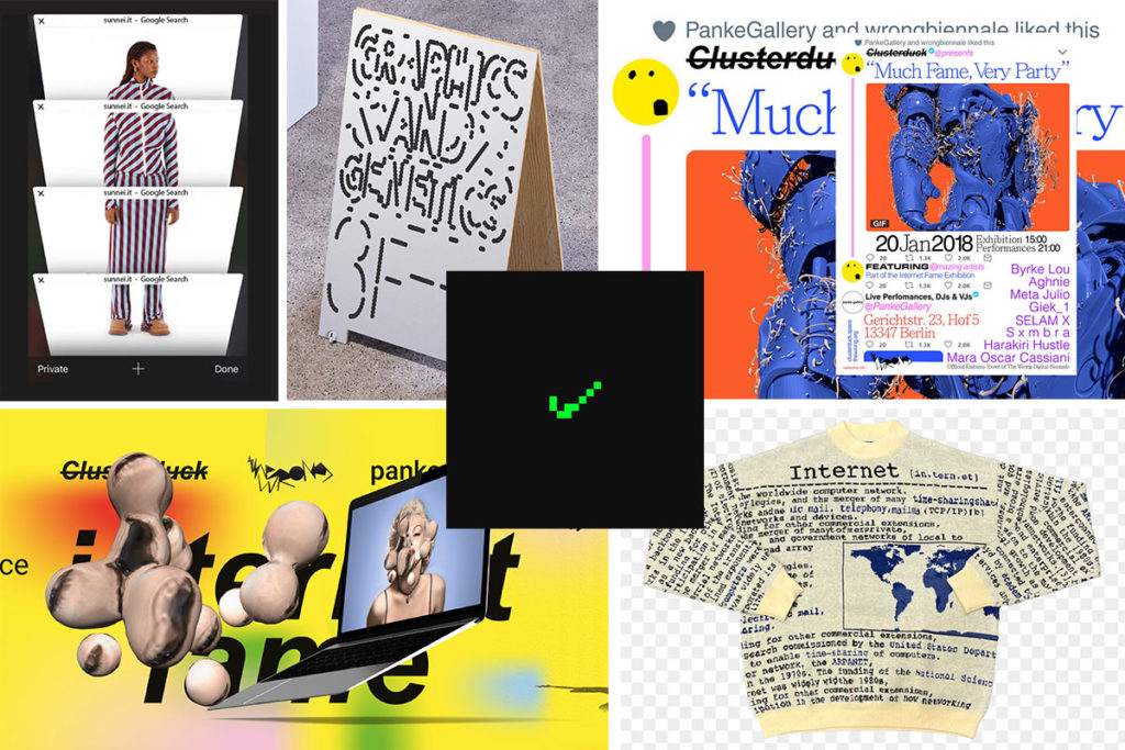
Internet-Inspired
Adopting a nostalgic internet look & feel has been around for a while and now it seems that the trend is incorporating more contemporary internet imagery too. It’s interestingly meta (no, I don’t mean the company) and adds layers of context to unravel in images and campaigns. The visuals we’ve seen can range from pixelated imagery and text, to campaign photos taken on Google Street View, to whole websites designed to mirror retro interfaces.

Images (clockwise from top left): Sunnei // Day Stay Hay // Clusterduck // Tern // Day Stay Hay // Clusterduck