Over the years, we’ve responded to many RFPs and dreamed up creative work to fit so many different styles, budgets, and desires. An RFP always poses a challenge in that you’re developing creative for a brand that you haven’t yet formed a relationship with, but at the same time, it can also allow you to loosen up creatively and approach a project with fresh eyes and a blank slate.
We’ve had so much fun working on pitches over the years and it can be disappointing when we don’t get to share our creative with the world. For that reason, this Halloween season we felt it was fitting to bring some of our favorite creative back from the dead!
Bonaire
When responding to an RFP for the Caribbean island of Bonaire, we wanted to differentiate it from the stereotypical visuals of Caribbean islands that audiences have come to expect. Because, while Bonaire shares many wonderful characteristics with its neighbors, it has set itself apart by prioritizing the protection and preservation of its environment, people and culture – it is an undiscovered gem. We highlighted this by creating collages with dynamic visuals which convey the energetic harmony of the many elements of the island – from the colorful Dutch architecture, to vibrant coral reef, to exquisite flora – and combine in a way that conjures a sense of magic. Simultaneously, the visuals provide a flexible brand system for Bonaire. The many elements can be broken apart to stand alone, or combined in myriad ways, depending on the message and execution. They become a visual language that is entirely unique to Bonaire.


Butter of Europe
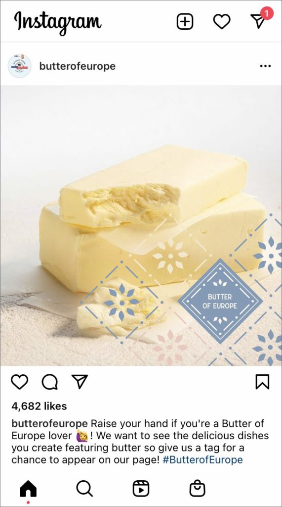
In our approach to an RFP for Butter of Europe, we wanted to position European butter as sophisticated, rich and an affordable luxury that is the secret ingredient in all great food! As a contemporary brand with a broad audience, it was also important to develop a flexible branding system that could accommodate every type of application, from digital to print, video to signage. For inspiration, we looked to street and restaurant scenes from across Europe and created brand elements that hinted at the distinctive signage and tiles that can be seen everywhere. These graphic elements all worked together and could be mixed & matched depending on the execution.


