
This week brought the first day of fall, and with it, the end of summer and the feeling of turning over a new leaf and getting a fresh start. This summer has been tough on everyone. We’re feeling pandemic fatigue, we’re in the middle of an election cycle, we’re experiencing widespread civil unrest… the list feels like it never ends. I don’t think I’m alone in welcoming fall as a new beginning.
But that being said, it’s also important to reflect. Even in things like design, understanding past behaviors will help us understand people’s perspectives and prepare for future trends.
This summer, I’ve noticed a growing intersection between design and social issues, both directly and tangentially. Design has always been social, and has always been used as a political tool, but with recent events drawing more and more people into taking it into their own hands. People have been volunteering their skills to create illustrations that explain complicated topics like prison reform or infographics that show the cost of police misconduct lawsuits. Designers have put out fonts that use less ink as a conservation effort, or started prioritizing dark mode designs to save energy.
I think the past few months have really shown where design can- and does- intersect with social justice. Consumers have started to realize the effect they have, and we can see it in the way they interact with the design around them, and how it reacts to them. People will make things more popular if they meet their needs, and less popular when the brand can’t keep up anymore.
I want to take a look at some of this summer’s design highs and lows, not just in graphic design, to see where we might stand as an industry moving forward. What do people really want from design? And how can design do better?
Let’s take a look.
HIGH: The Strawberry Dress
It doesn’t quite make sense that a $500, tea-length, pink tulle dress embellished with sequin strawberries would be the hot dress of the summer in the middle of both a pandemic and a recession, but here we are. If you’ve been anywhere on the Internet lately, or if you get our newsletter, you’ll have seen people talking about it. Or wearing it. Or drawing it. Or photoshopping celebrities heads into it.
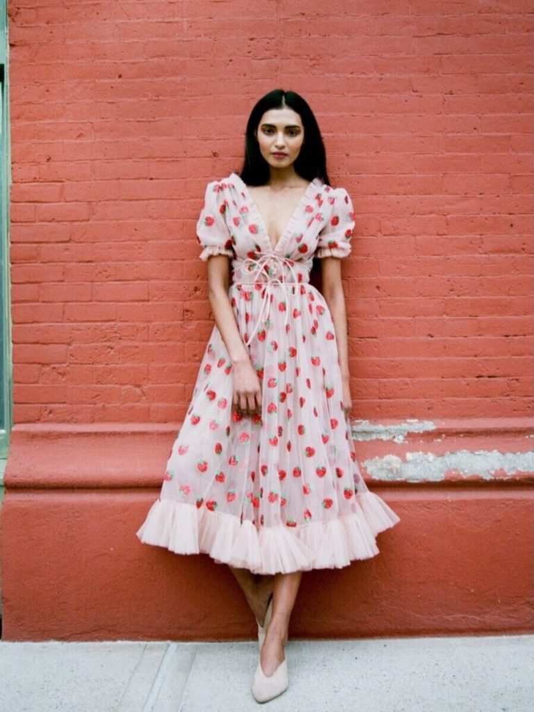
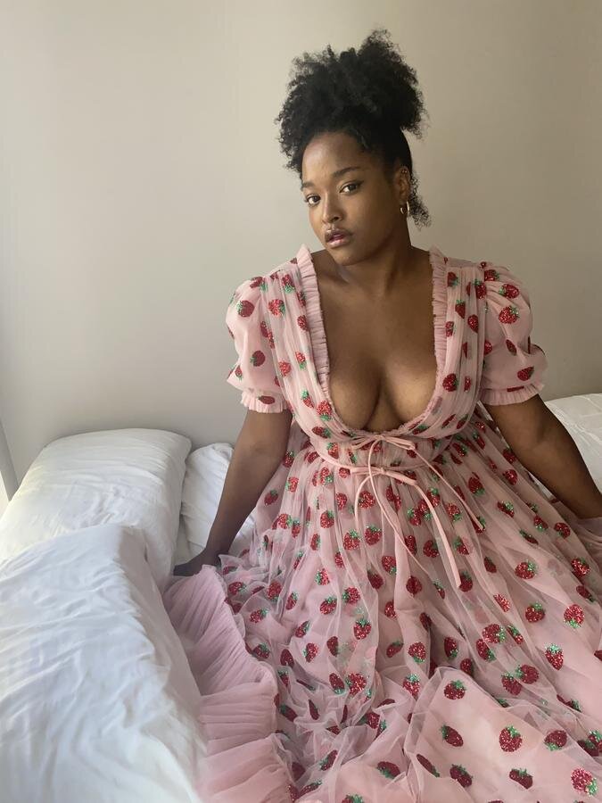
photo cred: lirikamatoshi.com
The “Strawberry Dress” has been an obsession of mine since I first saw model Tess Holliday wear it to the Grammys in January, and it’s only exploded since then.
Design-wise, it hits on two of the biggest talking points in any type of design: accessibility and ethics. This dress looks good on anyone- the simple shape and vast array of available sizes makes it so that anyone from a size 0 to a size 18 can wear it. The cost may not be as accessible, but the price is also not the pain point for this dress as it would be to a similar haute couture price tag. This dress is hand sewn and sold by a small, woman-owned business where every worker is paid a living wage. To most, $500 in the pocket of a small business is not the same as $500 in the pocket of a fashion conglomerate that exploits workers in third world countries to make their clothes. But the design also speaks to something that people have been wanting in their lives more lately, especially with the pandemic: whimsy. Above all else, this dress is fun. It’s pink! It’s frilly! It’s sparkly! And in a world dominated by grit- where kids shows and comics get “dark and realistic” reboots, where the #1 movie of the summer is always some explosion filled action extravaganza, where the people we’re told to admire are described as “badass” and “strong” and “take no nonsense”, and in a world where we’re constantly bombarded by bad news and corrupt politicians and even more disaster- isn’t it sometimes nice to just be soft?
LOW: Insincere Minimalism
A trend I’m sure everyone has noticed the past few years is the minimal-izing of just about every brand. Fashion houses are “moving on” from their iconic, detailed, serif font logos into very….similar, bold, sans serif logos.
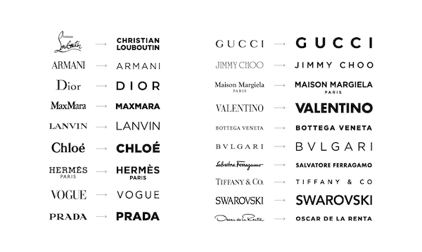
Brands like Staples, Kraft, Fisher-Price, Gap, Pandora, Subway, and Mastercard have all had stark makeovers in the past ten years, to varying degrees of success.
Two of this summer’s notable rebrands to me were BMW and Intel.


photo cred: Under Consideration/Brand New
While these aren’t Gap-level bad, they’re...well, they’re awfully similar. Both were fairly iconic logos, synonymous with their brands the way only the best logos can be, and in my opinion, didn’t really need a revamp. They still looked modern, they weren’t full of dated elements like 80s-style gradients or early 2000s reflection effects. Sure, the updates look nice. They’re relatively successful, as far as rebrands go, but they’re just…missing something. Older logos aren’t automatically outdated because they don’t fit the trend. They’re traditional, they have personality, they have recognition. I don’t know anyone who actually likes seeing yet another familiar logo get a sans serif makeover. I was actually told about the BMW update by a friend who’s not involved in design at all- and she hated it.
This is a bit of a contentious opinion. I’m not saying that every sans serif rebrand is bad or unneeded, and I’ve definitely seen some really good ones. It just feels like these brands are hoping that a new logo will make them more modern or relevant, instead of actually studying their audience to find out what they want. It’s like their executive board is yelling at each other: “What is it that people want? Do they like bold? Bright? Is that it? Do they like Instagram? WE should look like Instagram!” instead of actually trying to find out what “people” want, or who “people” really are.
I think businesses need to start really considering why they want a rebrand. Is their logo what’s outdated? Or is it something else? People as a whole are starting to cop on to shady business practices, and where possible, they’re taking their money to smaller, more ethical businesses. Things like thrifting, indie bookstores, flea markets, and resale platforms are gaining more popularity, and people are becoming aware about the industries that are producing their fast fashion clothes, their dairy milk, their two-day shipping. And this awareness is affecting business- Starbucks is aiming to remove all dairy products from their stores, and clothing stores like Patagonia and Reformation (or brands like Lirika Matoshi, creator of the strawberry dress!) that use ethical labor are gaining popularity. Brands need to remember that a better looking logo won’t help gain or keep customers- but better business practices will.
HIGH: Carrd
Think tumblr meets flash websites- an easy way to create a one page website for free.
Carrds have been used by twitter fandoms previously to this summer as a way to combat Twitter’s lack of customization for profiles and a limit on how much you can really say in your bio- Carrds allowed Twitter fans to create MySpace-like profile pages with anything from their names, pronouns, ages, and locations to “stan lists” of their favorite artists or links to their favorite content, all customized to the teeth with unique fonts, colors, and layouts.

But this summer, Carrd began being used for a different reason: to spread awareness. In the immediate aftershock of the BLM protests starting again in June, people began flocking to the internet in search of information, research, opinions, advice, anything on how to do something. Carrds like https://blacklivesmatters.carrd.co/ and https://blacklivesmatter.carrd.co/ circulated like wildfire and provided hubs of donation links, petitions, anti-racism resources, ways to contact politicians, protest and legal advice, reading and watch lists, and eons of different content and ways to help.
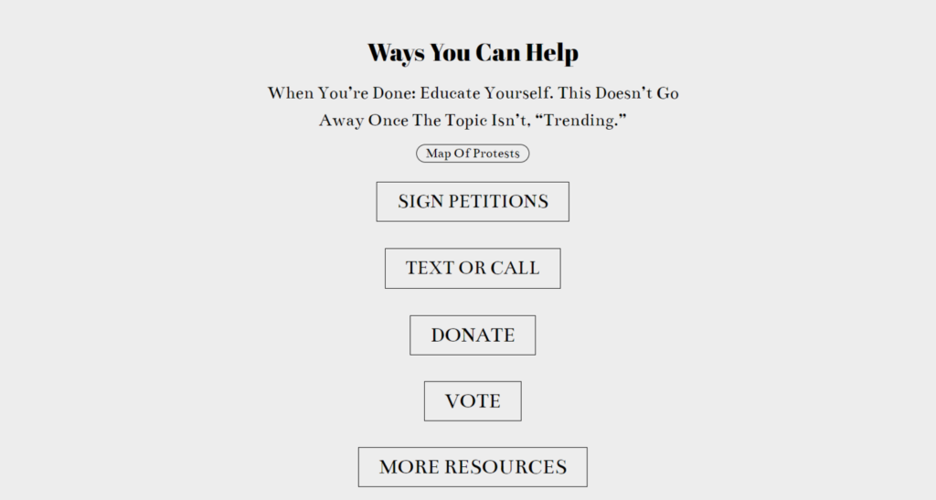
Carrds are now being used to provide information and ways to help on hundreds of different issues- Yemen, the Phillipines, Hong Kong, Uyghurs, Poland. There’s so many carrds now that there are multiple Carrds just linking out to other Carrds. There’s definitely issue there with how easy it is to make them- now there’s no centralized hub for information. And the lack of vetting means there’s not much proving that the info provided is true and unbiased. But i think what Carrd really proves, and the reason it spread so much, is that inaction often stems from lack of access to information. And Carrd provided a way to not only build a place for information to live for free, but it was a way to disseminate it quickly and easily.
Design has always been a social tool. But the trend of independent designers using their skills on their own time to help others and to help the world as a whole is definitely a trend I want to see continue.
This summer has taught us a few things:
- Consumers care about where their stuff is coming from, and who is making money off of them
- Ethics are becoming more important to consumers than aesthetics
- People rely on design as a way to understand complex topics
- Design can- and should- have a higher, social purpose
Really, what seems to be the case is that people are “waking up” more, so to speak. They’re beginning to look beyond crisp logos and bright happy colors to see what lies underneath. Design that succeeds embraces what people want: its accessible, ethical, it’s often powered or heightened by social media. It can be something as simple as a dress, or as complicated as fighting racism. Design that falls flat ignores people’s wants: it simply changes the facade, not the foundation. This is what we as designers have to consider, moving forward. Why are we designing what we are- is it helping? Or just covering up?