
One of the most exciting challenges designers face in an increasingly data-rich world is how to translate data so that it can be easily understood by a wide audience. The ways we collect data and the tools we use to analyze it are constantly evolving as our world becomes more and more data driven, especially in the financial services industry.
Infographics (short for information graphics) are a powerful storytelling tool that makes it easy for the audience to comprehend, analyze, and explore data. An infographic is a multimedia graphic aiming to present complex information and data in a way that is easy to understand.
Infographics often include data visualizations, more on these below, but must also provide context in the form of illustrations, facts, quotes, and captions. An infographic can stand on its own as a separate piece of content.
The most successful infographics are developed and designed with the viewer/user in mind, and follow these basic rules:
Words
• Spell them out, avoid abbreviations
• Should read left to right rather than vertically, diagonally or in different directions
Type
• Is clear and uses upper and lower case
• Fonts are readable rather than decorative
• Fonts scale well
Color
• Avoid elaborate color coding or shadows
• A few distinct colors are more visually inviting and focus attention better than many colors
• Select colors that are usually easily readable for color blind or color deficient viewers (5 to 10% of the population)
Labels
• Should be part of the graphic making a legend unnecessary
Illustrations
• Use only simple illustrations that support the overall message of the piece but do not directly interpret the data
Data visualizations, graphical representations of a set of data, can be a component of an infographic. Although they are often confused with infographics, they are not the same. A data visualization on its own is not an infographic.
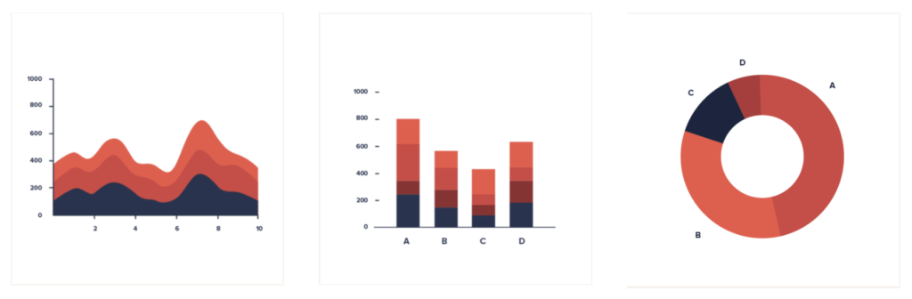
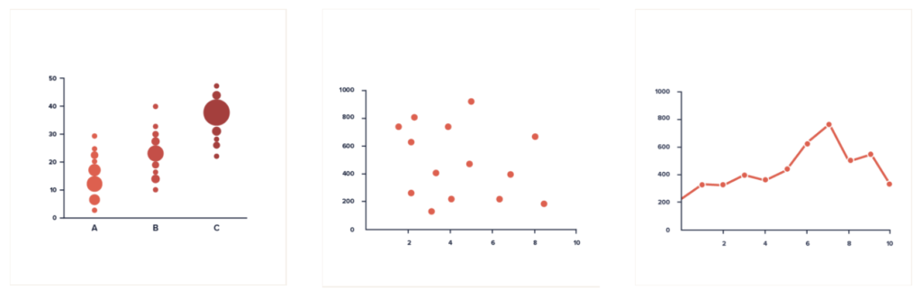
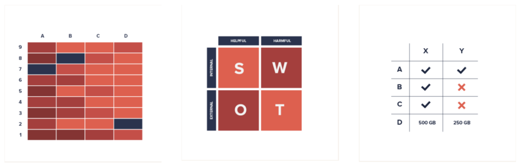
The challenge for graphic designers is to choose the most appropriate visual vehicle to effortlessly communicate the point of the story. Each of the different styles – charts, diagrams, geospatial, plots and tables – offer a distinct visual arrangement that can be used to communicate comparisons, trends over time, correlation, and geographical data.
In a chart the data is represented by symbols, such as bars in a bar chart, lines in a line chart, or slices in a pie chart.
A diagram is a drawing that shows the arrangement and relationships of parts.

Geospatial is defined as geographic data and information that has an implicit or explicit association with a location relative to Earth.

A plot is a graphic technique representing a data set to show the relationship between two or more variables.
A table is an arrangement of data in rows and columns, or possibly in a more complex structure.
Here’s a great reference resource to help you decide the best way to illustrate and communicate a set of data.
In summary, because the human brain processes visuals better than text, infographics are highly effective when used in the right way to present data and tell stories.